Color Psychology: Understand how colors affects in Branding
Color isn’t just a visual element; it’s a powerful psychological tool that influences how we perceive the world around us. From the clothes we wear to the products we buy, color plays a significant role in shaping our emotions, decisions, and even our behavior.
Choosing the right color palette for your website, app, or brand isn’t just about aesthetics; it’s about understanding how color speaks to your users’ minds and using that knowledge to create a targeted and impactful experience.
What Color Psychology Mean?
Our brains are hardwired to associate specific colors with different emotions and meanings. This phenomenon, known as color psychology, has been studied extensively, revealing a fascinating relationship between color and human behavior.
Simply, Color psychology is the study of hues as a determinant of human behavior.
Let’s understand it in depth…

The Science of Color Psychology:
When light hits our eyes, the cones and rods in our retinas register wavelengths, which our brains then interpret as color. But color perception isn’t solely a physical process. Cultural experiences, personal memories, and even biology all play a role in how we perceive and respond to color.
Color psychology delves into these connections, examining how different hues evoke specific emotions and physiological responses. For instance, red, often associated with fire and blood, can raise our heart rate and blood pressure, making us feel stimulated or even agitated. On the other hand, cooler colors like blue and green tend to have a calming effect, lowering heart rate and promoting feelings of peace and tranquility.
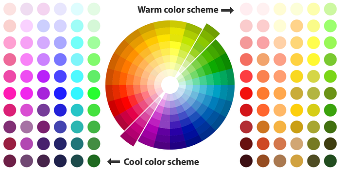
- Warm colors: Red, orange, and yellow are generally considered “warm” colors. They evoke feelings of energy, excitement, passion, and even aggression. Think about the red “sale” signs that grab your attention or the orange caution cones that demand immediate action.
- Cool colors: Blue, green, and purple fall under the “cool” category. These colors are associated with calmness, peace, trust, and security. Imagine the blue hues used in social media platforms that encourage relaxation and connection, or the green often seen in healthcare branding that evokes feelings of well-being and serenity.
- Color saturation: The intensity of a color also plays a role. Brighter colors tend to be more attention-grabbing and stimulating, while muted tones offer a sense of sophistication and subtlety. Think about the vibrant colors used in children’s toys that demand attention versus the muted tones of luxury brands that convey elegance and exclusivity.

How Color Psychology Influences
Studies have shown that different colors can trigger a cascade of physiological and emotional responses.
For example, the sight of red can increase heart rate and blood pressure, while blue can have a calming effect. This emotional connection is deeply rooted in our evolutionary past, where certain colors were associated with specific dangers or opportunities.

Here are some key examples of how different colors influence our emotions:
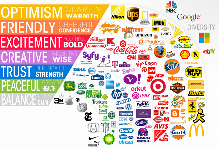
- Red: Excitement, passion, danger, warning
- Orange: Energy, creativity, enthusiasm, warmth
- Yellow: Optimism, happiness, caution, playfulness
- Green: Growth, harmony, peace, balance
- Blue: Trust, security, calmness, sadness
- Purple: Luxury, creativity, wisdom, mystery
Color and User Behavior
Understanding how color affects user behavior is crucial for creating a successful digital experience. Here are some examples:
- Conversions: Studies have shown that websites with a red call-to-action button have higher conversion rates than those with green buttons. This is because red is associated with urgency and excitement, prompting users to take action.
- Brand perception: The colors you choose for your brand can significantly impact how users perceive your company.
For example, a tech startup using bright blue and green might be seen as innovative and playful, while a financial institution using dark blue and gray might convey trust and security. - Engagement: Certain colors can influence how long users stay on your website or app. Cool colors like blue can encourage längere reading sessions, while warm colors like orange can create a sense of urgency and encourage quick decisions.
Learn to Choose the Right Palette:
With the power of color psychology in mind, how do you choose the right palette for your project? Here are some tips:
- Consider your target audience: Who are you trying to reach? What emotions and associations do you want to evoke? Understanding your audience’s demographics and preferences will guide your color choices.
- Define your brand identity: What are your brand values and personality? Your color palette should reflect your brand’s essence and differentiate you from competitors.
- Seek inspiration: Look at successful brands in your industry and analyze their color choices. What works for them? How can you adapt their strategies to your own brand?
- Test and iterate: Don’t be afraid to experiment with different colors and see what resonates with your users. A/B testing can help you identify the most effective palette for achieving your goals.
Examples of Effective Color Palettes:
- Airbnb: The use of calming blues and greens evokes a sense of trust and security, perfect for a platform where users entrust their homes to strangers.
- Slack: The vibrant purple and pink hues create a playful and energetic atmosphere, ideal for a communication tool used in fast-paced workplaces.
- Netflix: The classic black and red combination exudes sophistication and mystery, aligning with the brand’s focus on high-quality entertainment.
Conclusion
Color is a powerful tool that can shape user experience, influence decisions, and ultimately impact the success of your project.
By understanding the psychology behind color and using it strategically, you can create a visually appealing and emotionally resonant experience that speaks directly to your users’ minds.
Remember, color is more than just aesthetics; it’s a language that can be used to connect with your audience on a deeper level. So, choose your colors wisely and watch your brand flourish.
